Timeline
Role
Branding
Design
Development
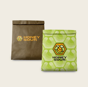
Honey Sour, a new dispensary with established locations in Montana, approached us to create a modern brand on a tight budget. Despite having the name “Honey Sour,” they lacked any existing branding or website. Their competitors had early adopted branding that appeared outdated, and Honey Sour needed a compelling and cohesive brand to stand out in the community.
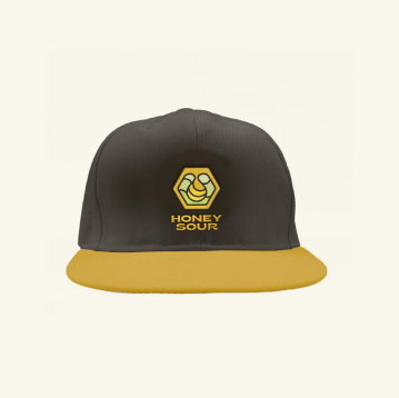
Early in my first year as a full-time designer at Hybrid Marketing Co, I took on the challenge of developing the entire brand and website for Honey Sour. This included selecting typography, defining a color palette, and curating imagery that captured the essence of Montana’s local towns and scenic landscapes. By focusing on a visually appealing and user-centric design, I aimed to create a brand identity that resonated with the community and differentiated Honey Sour from its competitors.
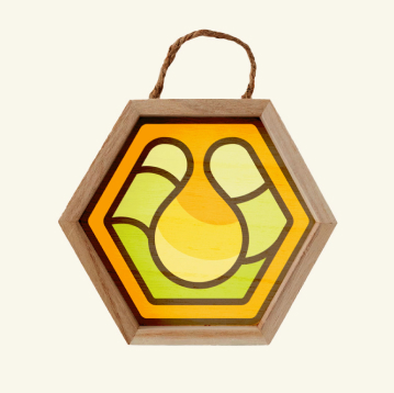
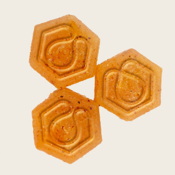
Develop Honey Sour’s brand from the ground up, utilizing the client’s chosen colors to create an engaging and modern identity. The aim was to design a brand and website that captured the playful essence of honey, incorporating elements like honey drips and mountain shapes. The objective was to create a standout icon within the community, with a consistent and visually pleasing representation across all digital platforms.


The result was a polished, visually appealing brand and website that stood out in the community, effectively setting Honey Sour apart from their competitors with outdated marketing. This project not only established a strong online presence for Honey Sour but also provided me with invaluable experience for future builds and design systems.


© 2024 Russ Ault. All rights reserved.