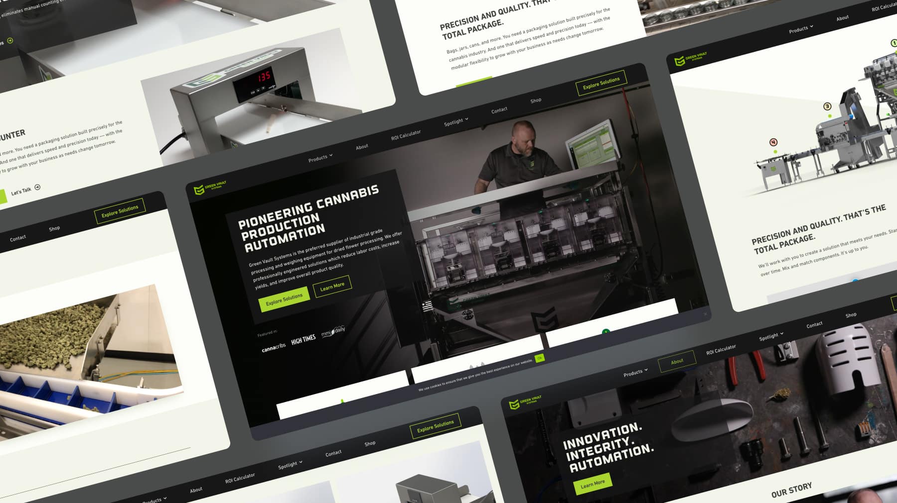
The original Green Vault Systems website posed accessibility challenges, featuring a design that was visually overwhelming and taxing on the eyes. The color scheme, font choices, and overall layout made it difficult for visitors to absorb information about the innovative products and solutions offered by the company.
Goal
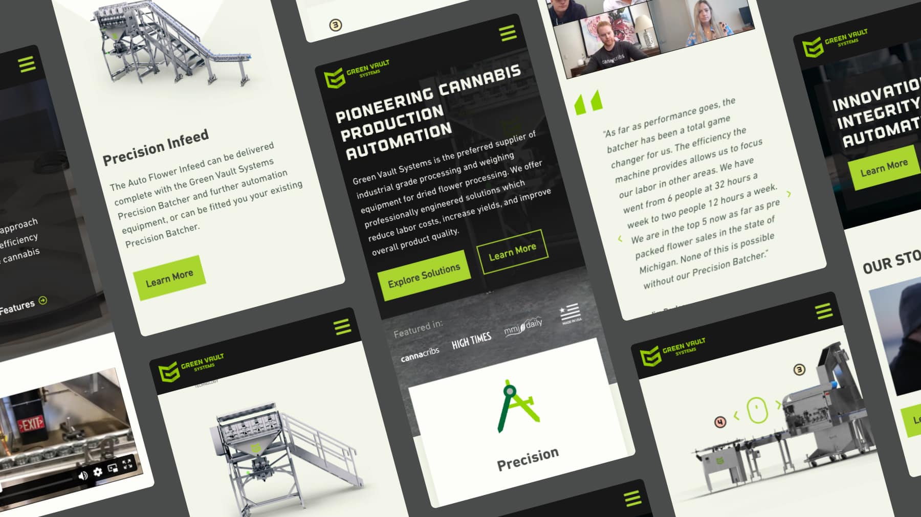
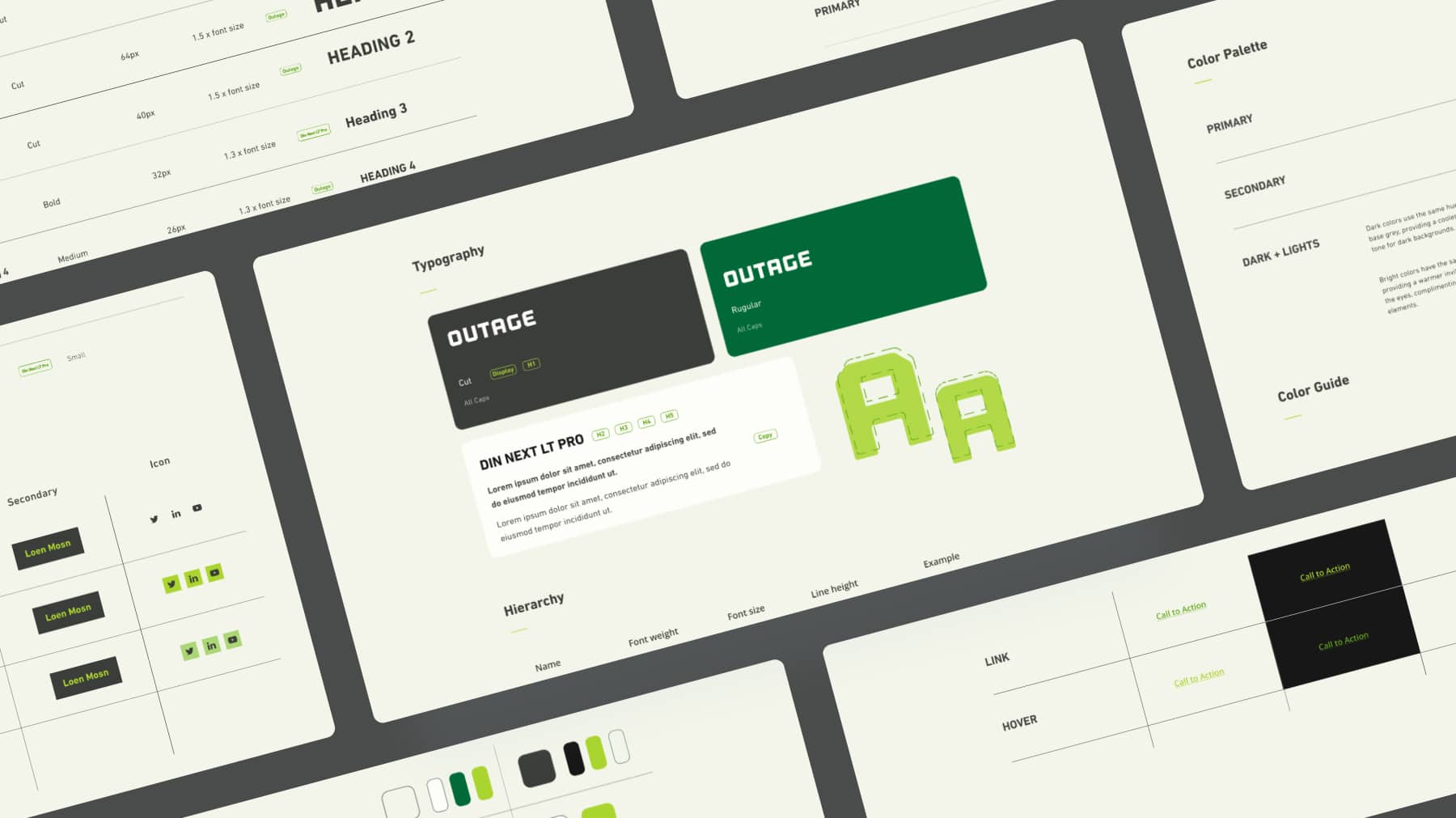
To enhance the website’s accessibility and user experience, the goal was to establish a layout and color palette that prioritized user engagement, ensuring visitors could easily navigate the site and comprehend the unique features of each product.
Additionally, integrating videos showcasing the products in use and the brand’s story aimed at customer education and providing product details to drive user engagement.
Solution
Established a design system, incorporating a softer color palette to minimize visual strain by creating and integrating tones from brand colors, using primary green as the main call-to-action element.
Videos were added throughout the site, showcasing each product in real-world scenarios and creating an engaging and educational user experience.
Implemented a user flow that guided visitors through product introduction, in-depth education, and clear details. This approach cultivated a user-friendly environment, supporting accessibility and product education, contributing to increased user engagement and potential sales.